> ## Documentation Index
> Fetch the complete documentation index at: https://docs.mage.ai/llms.txt
> Use this file to discover all available pages before exploring further.
# Customizable dashboards
> There are 2 dashboards: a dashboard for all your pipelines and a dashboard for each pipeline. You can add charts of various types with different sources of data. Use these dashboards for observability or for analytics.
export const urls = {
chat: 'https://www.mage.ai/chat',
oss: 'https://www.mage.ai/oss',
pro: 'https://cloud.mage.ai/sign-up'
};
export const ProOnly = ({button = 'Get started for free', description = 'Try our fully managed solution to access this advanced feature.', source = 'documentation', title = 'Only in Mage Pro.'}) =>
;
export const ProButton = ({href, label = 'Get started with Mage Pro for free', source = 'documentation'}) => ;
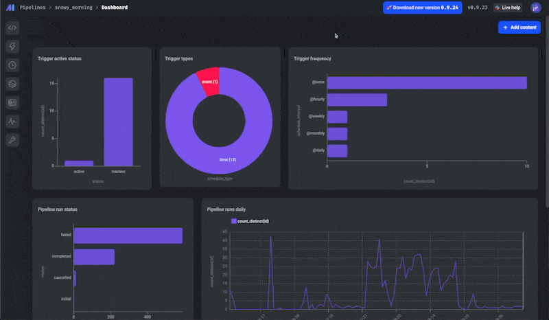 ## Pages with customizable dashboards
1. Project overview page (`/overview?tab=Dashboard`)
2. Pipeline dashboard page (`/pipelines/[:id]/dashboard`)
***
## Adding charts
1. In the top right corner of the dashboard, click the button labeled
+ Add content.
2. Click the dropdown option labeled Create new chart.
***
## Configuring chart
### Chart name
Human readable name for your chart.
### Chart type
Choose from a variety of visualizations.
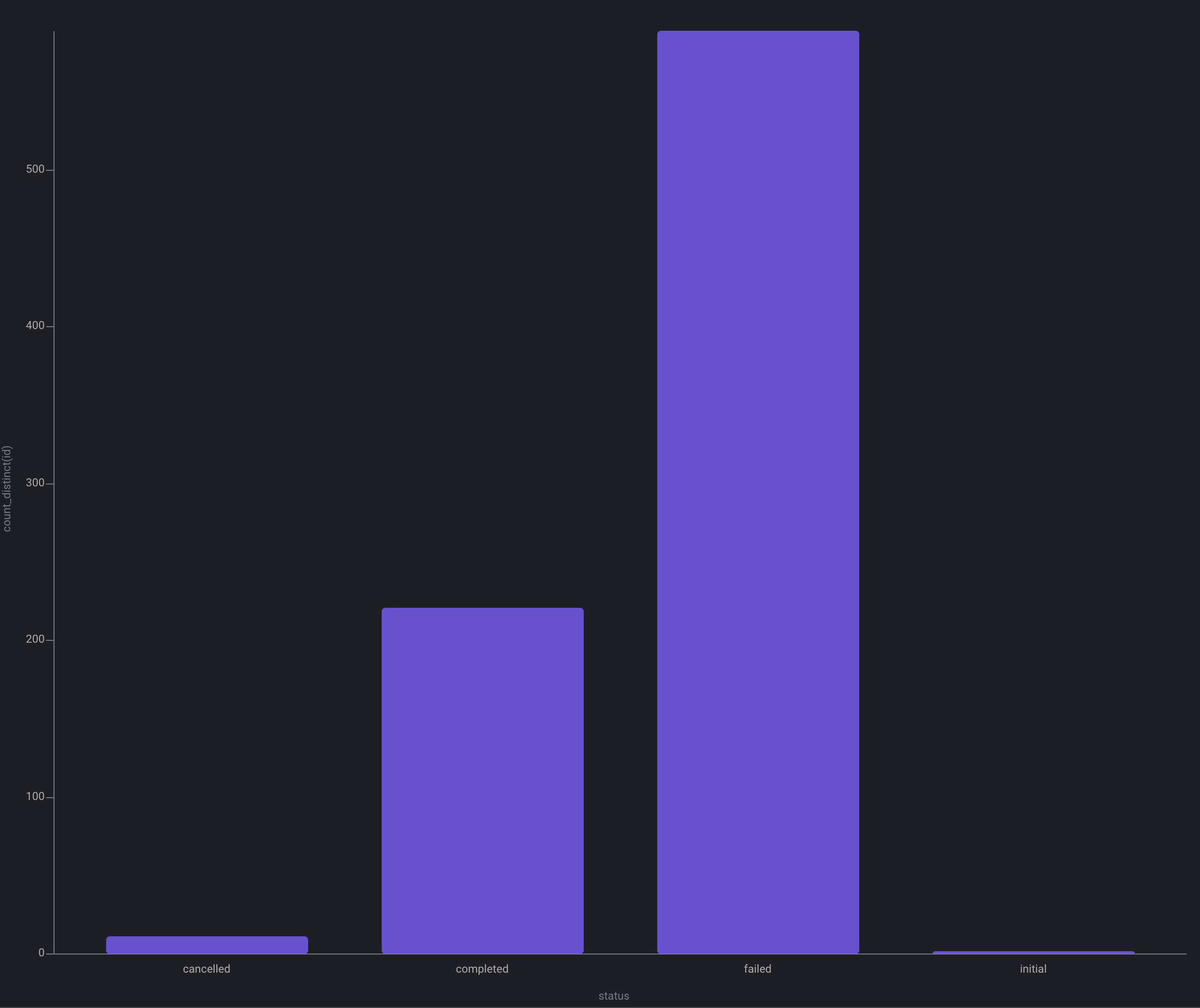
#### Bar chart
## Pages with customizable dashboards
1. Project overview page (`/overview?tab=Dashboard`)
2. Pipeline dashboard page (`/pipelines/[:id]/dashboard`)
***
## Adding charts
1. In the top right corner of the dashboard, click the button labeled
+ Add content.
2. Click the dropdown option labeled Create new chart.
***
## Configuring chart
### Chart name
Human readable name for your chart.
### Chart type
Choose from a variety of visualizations.
#### Bar chart
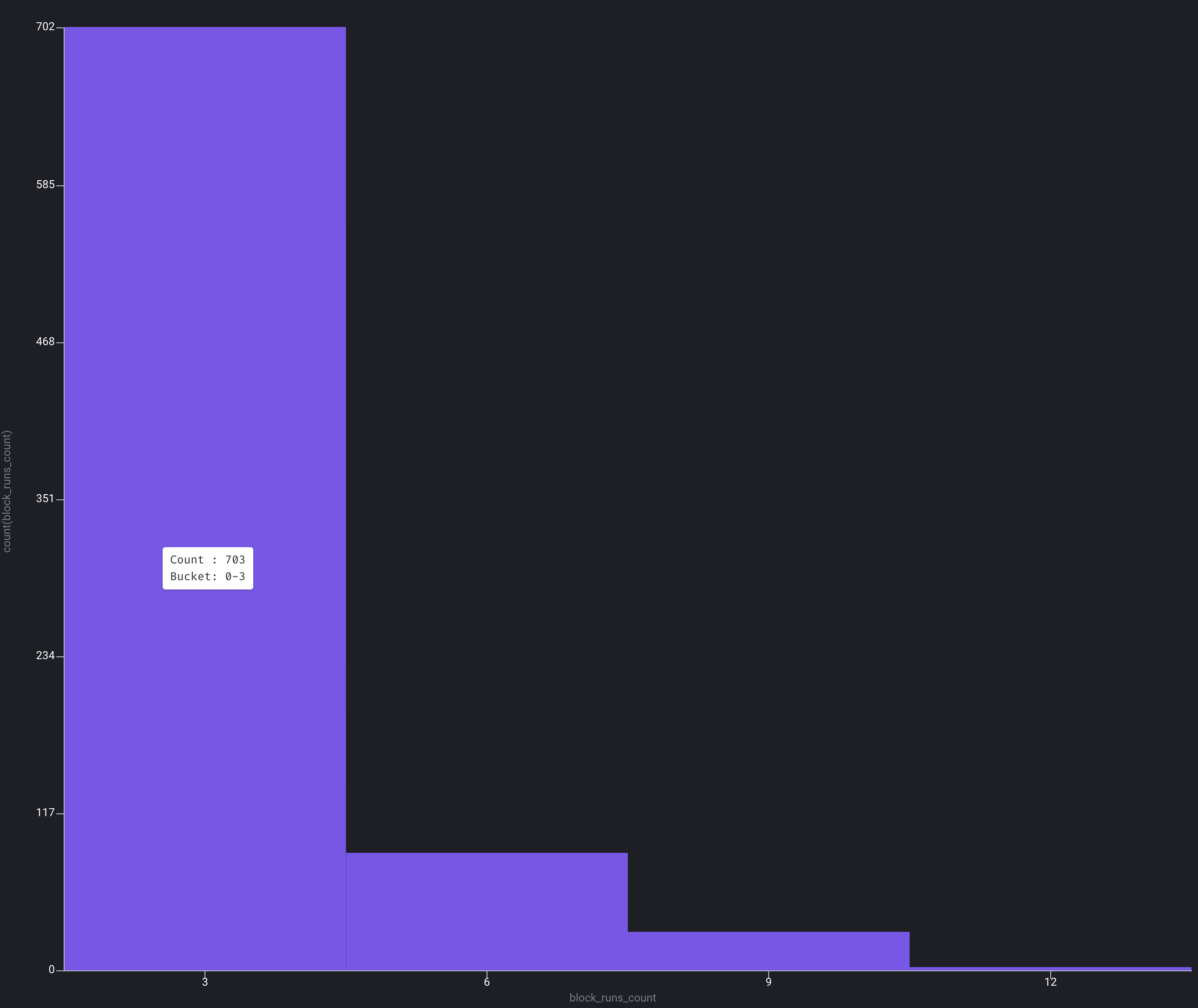
#### Histogram
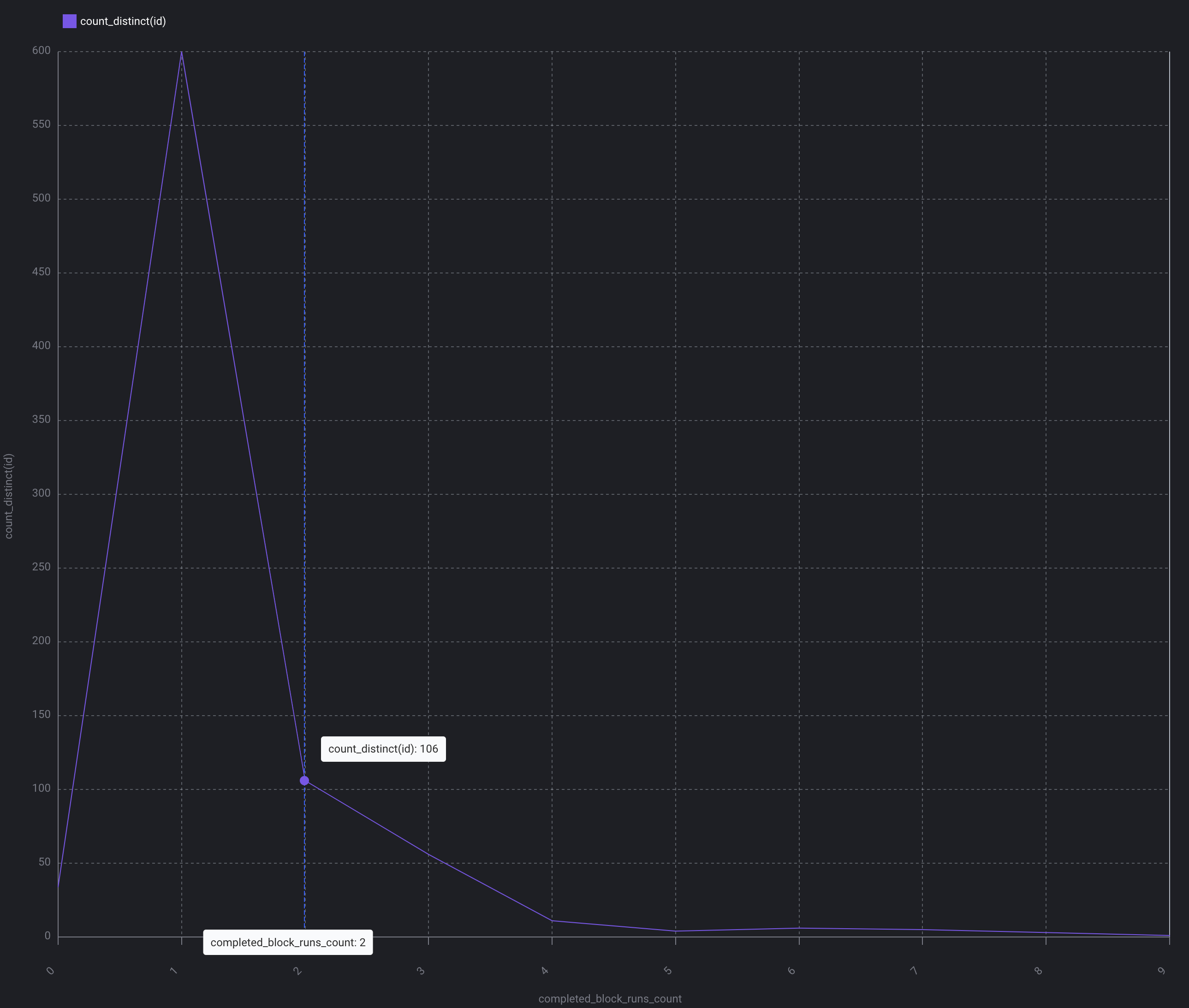
#### Line chart
#### Pie chart
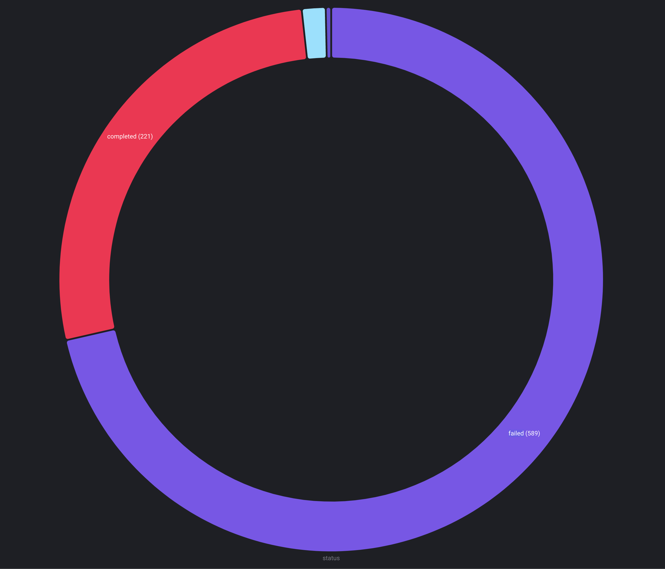
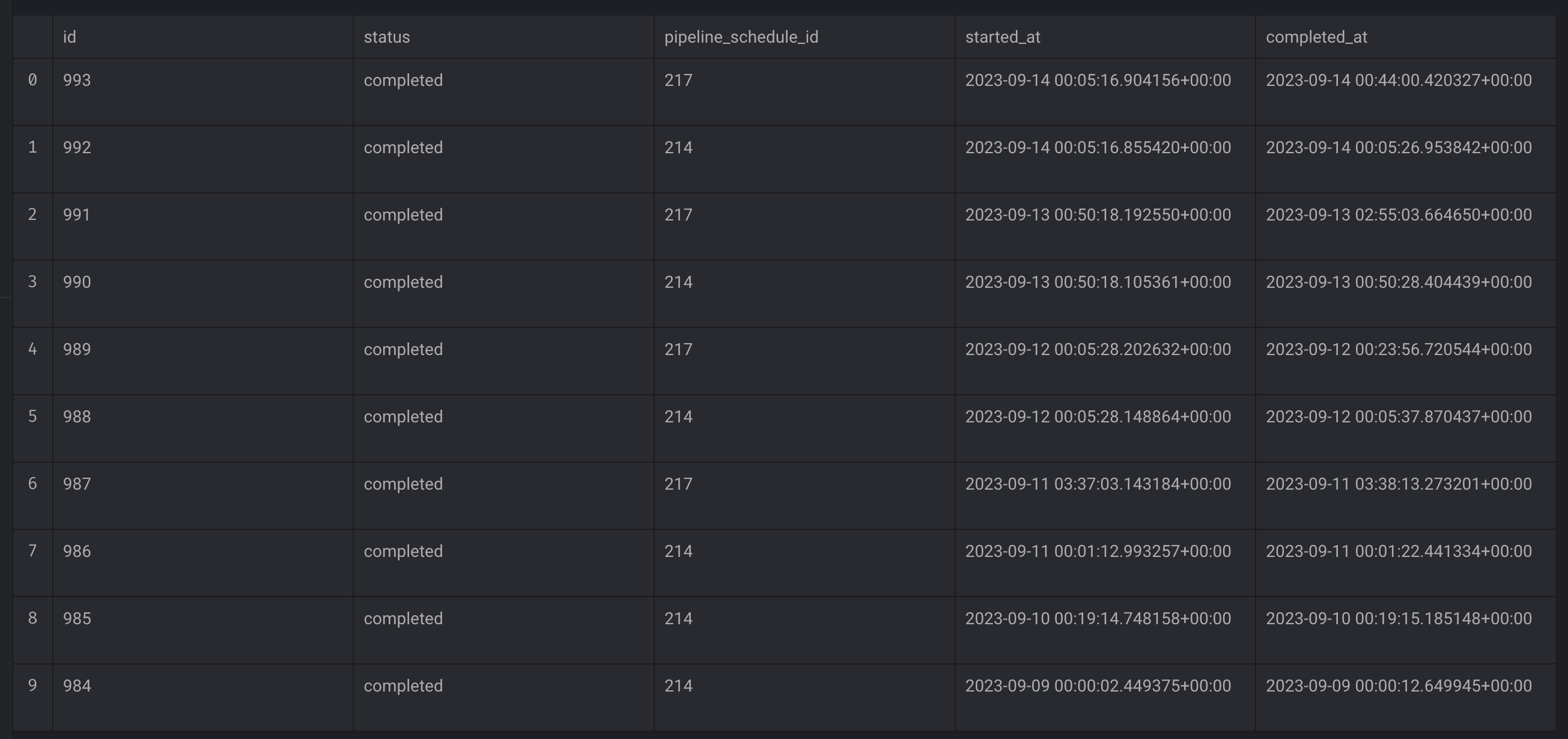
#### Table
#### Time series bar chart
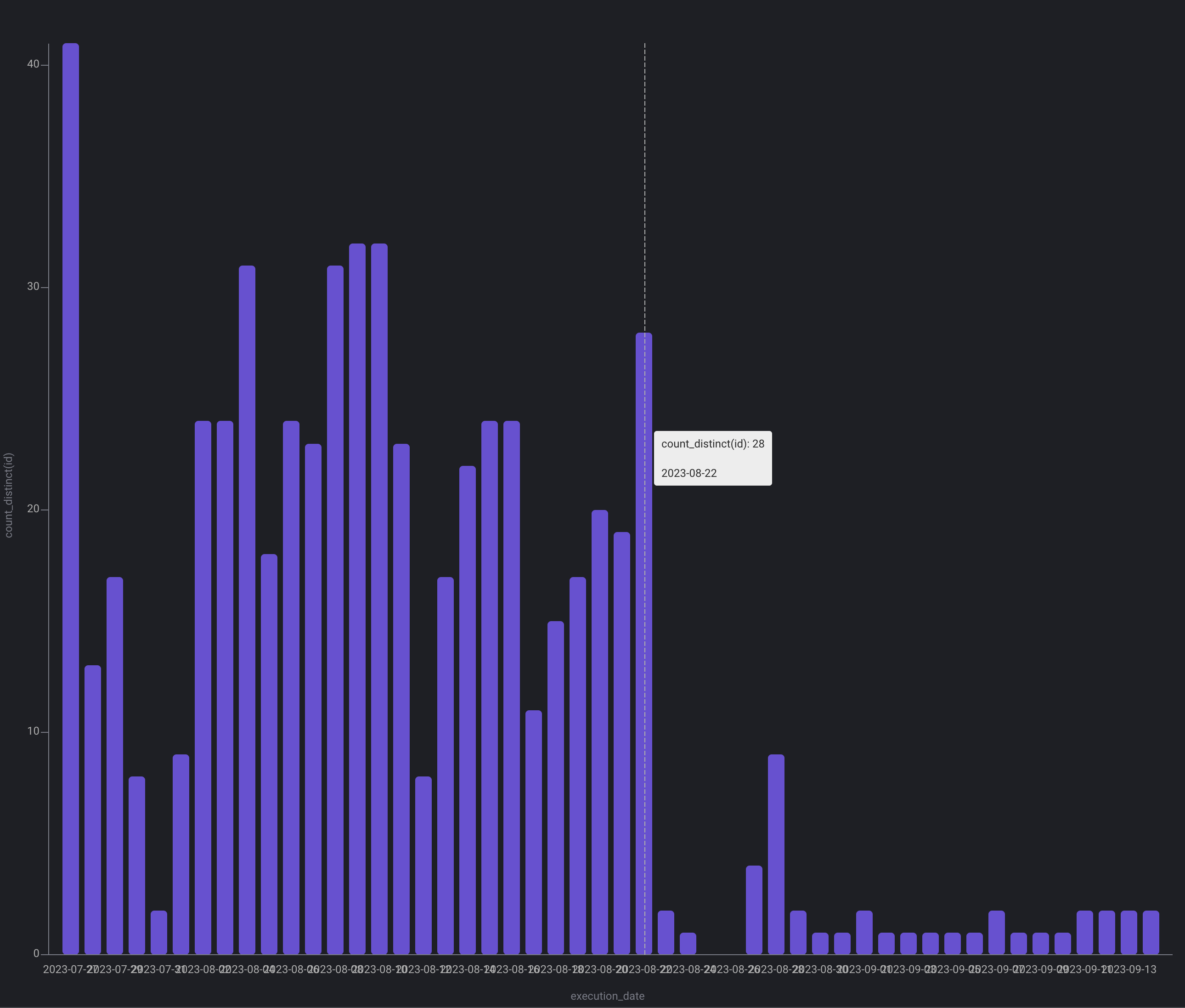
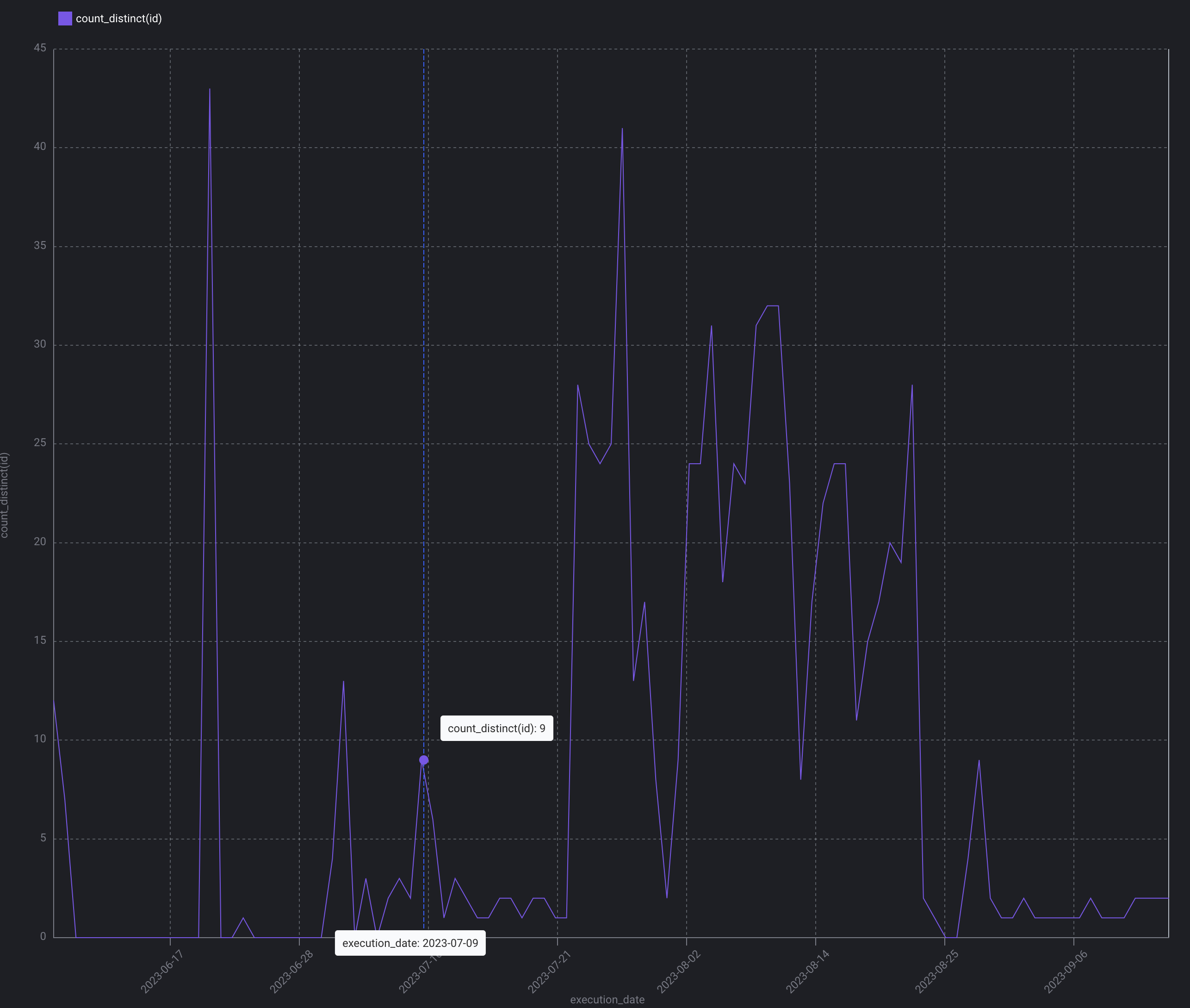
#### Time series line chart
### Data source
A chart has at least 1 data source.
In the near future, a chart can have more than 1 data source.
#### Block data output (type)
Get the output data from a block in a specific pipeline.
| Field | Description | Required | Example |
| ------------- | ----------------------------------------------------------------------------------------------------------------------------------------------------------------------------------------- | -------- | ------------------ |
| Pipeline UUID | The pipeline UUID the block belongs to. | ✅ | `example_pipeline` |
| Block UUID | The block UUID you want data from. | ✅ | `load_api_data` |
| Partitions | Enter a positive or a negative number. If positive, then data from the block will be the most recent N partitions. If negative, then data from the block will be the oldest N partitions. | | `3` |
#### Block runs (type)
Get data from all block runs or
all block runs from a specific pipeline.
#### Custom code (type)
Define a function using the `@data_source` decorator that returns the data
for your chart.
```python theme={"system"}
@data_source
def d(*args, **kwargs):
return [[dict(id=1), dict(id=2)]]
```
#### Pipelines (type)
Get data from all pipelines.
#### Pipeline runs (type)
Get data from all pipeline runs or
all pipeline runs from a specific pipeline or
all pipeline runs from a specific trigger.
#### Triggers (type)
Get data from all triggers or
all triggers from a specific pipeline.
#### Refresh interval
How frequent do you want this chart to automatically fetch new data from its data source?
Enter a number in milliseconds (e.g. 1000ms is 1 second).
### Chart display settings
#### Group by columns
Select the column to group your data by.
#### Metrics
| Field | Description | Required | Example |
| ----------- | ----------------------------------------------------------------------------------------------------- | -------- | --------- |
| Aggregation | After grouping the data by 1 or more columns, perform the following aggregation function on a column. | ✅ | Average |
| Column | Select the column to perform the aggregation function on. | ✅ | `country` |
#### Chart style
Some charts have multiple styles of the same visualization.
#### Sort direction
Some charts can sort the visualizations in ascending or descending order.
#### Number of buckets or slices
You can limit the number of buckets or slices that are displayed for some charts.
#### Time column
For the time series charts, you must choose which column contains the date or time
value to group the data by.
#### Time interval
For the time series charts, you can choose how granular the interval is between each
date or time values in the time column. For example, you can display your time series
data on a daily basis or annual basis.
***
## Custom code for chart
The following decorators can optionally be used to further customize your chart.
### `@data_source`
If the data source type is `Custom code`, then this function’s return value is the
data that the chart will display.
However, if the data source type is anything else besides `Custom code`,
then this function can be used for post processing of the data from the selected
data source.
For example, let’s say the data source type is `Block data output` and
the number of partitions is `2`. The chart will retrieve the 2 most recent partitions of data from
that block.
In the `@data_source` decorated function, you can write code to operate on 2 of
those block output data:
```python theme={"system"}
from typing import List
@data_source
def filter_data(block_data_output: List, **kwargs) -> List:
df_partition_1, df_partition_2 = block_data_output
df_1 = df_partition_1[df_partition_1['Age'] >= 21]
df_2 = df_partition_2[df_partition_2['Age'] >= 21]
return [df_1, df_2]
```
### `@x`
Write custom code to return the `x` values for your chart.
X values typically contain the column that you group your data on.
For example, group pipelines by their type.
```python theme={"system"}
from typing import List
@x
def some_columns(data_from_data_source, **kwargs) -> List:
df_partition_1 = block_data_output[0]
return df_partition_1.columns[:3]
```
### `@y`
Write custom code to return the `y` values for your chart.
Y values typically contain the value for a group of rows.
For example, the number of pipelines that are data integration pipelines.
```python theme={"system"}
from typing import List
@y
def number_of_data_integration_pipelines(data_from_data_source, **kwargs) -> List:
df_partition_1 = block_data_output[0]
count = len(df_partition_1[df_partition_1['type'] == 'data_integration'].index)
return [count]
```
### `@xy`
This function combines the purpose of `@x` and `@y` into 1 function.
Use this function if you want to custom both the `x` and `y` values and you want to share the
same variables defined within the function.
The difference is that you must return a tuple where
the `x` values are 1st and the `y` values are 2nd.
```python theme={"system"}
from typing import List, Tuple
@xy
def columns_and_numbers(data_from_data_source, **kwargs) -> Tuple[List]:
df_partition_1 = block_data_output[0]
count = len(df_partition_1[df_partition_1['type'] == 'data_integration'].index)
return df_partition_1.columns[:1], [count]
```
### `@configuration`
Each chart has a configuration dictionary that stores the chart settings.
These chart settings are stored in a YAML file.
However, if you want to encode the configurations into the chart file and reuse the configurations
in other dashboards, you can write a function that returns a dictionary that will be used
to configure the chart.
```python theme={"system"}
from typing import Dict
@configuration
def chart_settings(*args, **kwargs) -> Dict:
return dict(
chart_type='time series line chart',
group_by=['execution_date'],
metrics=[dict(
aggregation='count_distinct',
column='id',
)],
time_interval='day',
)
```
### `@columns`
In the chart settings, when choosing the group by columns, number columns, time column, metrics,
etc., the chart must know about what available columns are selectable.
Typically, the chart will attempt to infer the columns from the data source.
However, you can customize the logic of how the columns are inferred or
which columns are available to select.
```python theme={"system"}
from typing import List
@columns
def some_columns(data_from_data_source, **kwargs) -> List:
df_partition_1 = block_data_output[0]
return df_partition_1.columns[:3]
```
### `@render`
Define a function that returns a Base64 string representation of a JPEG/JPG image,
PNG image, or a complete HTML string (with html and body tags).
#### Render JPEG or JPG
```python theme={"system"}
import base64
import io
import matplotlib.pyplot as plt
# render_type can be 'jpeg' or 'jpg'
@render(render_type='jpeg')
def r(*args, **kwargs):
# creating the dataset
data = {'C':20, 'C++':15, 'Java':30,
'Python':35}
courses = list(data.keys())
values = list(data.values())
fig = plt.figure(figsize = (10, 5))
# creating the bar plot
plt.bar(courses, values, color ='maroon',
width = 0.4)
plt.xlabel("Courses offered")
plt.ylabel("No. of students enrolled")
plt.title("Students enrolled in different courses")
plt.show()
my_stringIObytes = io.BytesIO()
plt.savefig(my_stringIObytes, format='jpg')
my_stringIObytes.seek(0)
my_base64_jpgData = base64.b64encode(my_stringIObytes.read()).decode()
plt.close()
return my_base64_jpgData
```
#### Render PNG
```python theme={"system"}
import base64
import io
import matplotlib.pyplot as plt
import numpy as np
@render(render_type='png')
def r(*args, **kwargs):
t = np.arange(0.0, 2.0, 0.01)
s = 1 + np.sin(2*np.pi*t)
plt.plot(t, s)
plt.xlabel('time (s)')
plt.ylabel('voltage (mV)')
plt.title('About as simple as it gets, folks')
plt.grid(True)
plt.show()
my_stringIObytes = io.BytesIO()
plt.savefig(my_stringIObytes, format='png')
my_stringIObytes.seek(0)
my_base64_jpgData = base64.b64encode(my_stringIObytes.read()).decode()
plt.close()
return my_base64_jpgData
```
#### Render HTML
```python theme={"system"}
import plotly.graph_objects as go
@render(render_type='html')
def r(*args, **kwargs):
fig = go.Figure(
data=[go.Bar(y=[2, 1, 3])],
layout_title_text="A Figure Displaying Itself"
)
return fig.to_html(full_html=False)
```
***
## Recommended charts
Depending on which page you’re on, adding recommended charts will automatically configure
and add a few charts to your dashboard with little effort.
The added charts will show visualizations with different chart types and various data sources.
***
## Resize chart
When you resize a chart on the dashboard, you can change the width and height.
### Width
Set the width to a number.
This number is divided by the sum of the width numbers from all the charts in the same row.
The resulting number is the percentage of the row the chart will expand horizontally to.
For example, if you have a row with 5 charts and the 1st chart has a width of 6 and the other
4 charts have a width of 1, then the 1st chart will take up 60% of the entire row’s width.
### Max width percentage
Even if a chart is to take up a large percentage of the row’s entire width,
you can set a limit as to how wide the chart should be.
For example, in the above example the 1st chart should be 60% of the entire row’s width.
However, you can set that chart’s max width percentage to 50 and the 1st chart will only
expand to 50% of the row’s entire width.
### Height
Set this value to the number of pixels you want your chart to have in height.
***
## Move chart
Click and hold down on a chart to begin dragging it. Then, drag the chart to move it and
then release the click while on top of another chart to insert the initial chart after the
chart that you dropped it on.
***
## Remove chart
This will remove the chart from the current dashboard.