> ## Documentation Index
> Fetch the complete documentation index at: https://docs.mage.ai/llms.txt
> Use this file to discover all available pages before exploring further.
# Analytics
> Create AI-powered dashboards from the data already flowing through Mage Pro.
export const ProOnly = ({button = 'Get started for free', description = 'Try our fully managed solution to access this advanced feature.', source = 'documentation', title = 'Only in Mage Pro.'}) => ;
Analytics turns the data already flowing through Mage into interactive dashboards for business
reporting, operational insight, and team decision-making. Use it to explain revenue trends,
customer growth, product adoption, campaign performance, data quality, model behavior, warehouse
costs, and any other metric your pipelines produce.
Instead of exporting data to another tool before anyone can understand it, teams can create and
refresh dashboards directly where the data is prepared. Analysts, data engineers, operators, and
business stakeholders can all work from the same trusted source.
Analytics is different from monitoring. Monitoring tells you whether your pipelines, schedules,
logs, alerts, and infrastructure are healthy. Analytics tells you what the data means and what your
team should do next.
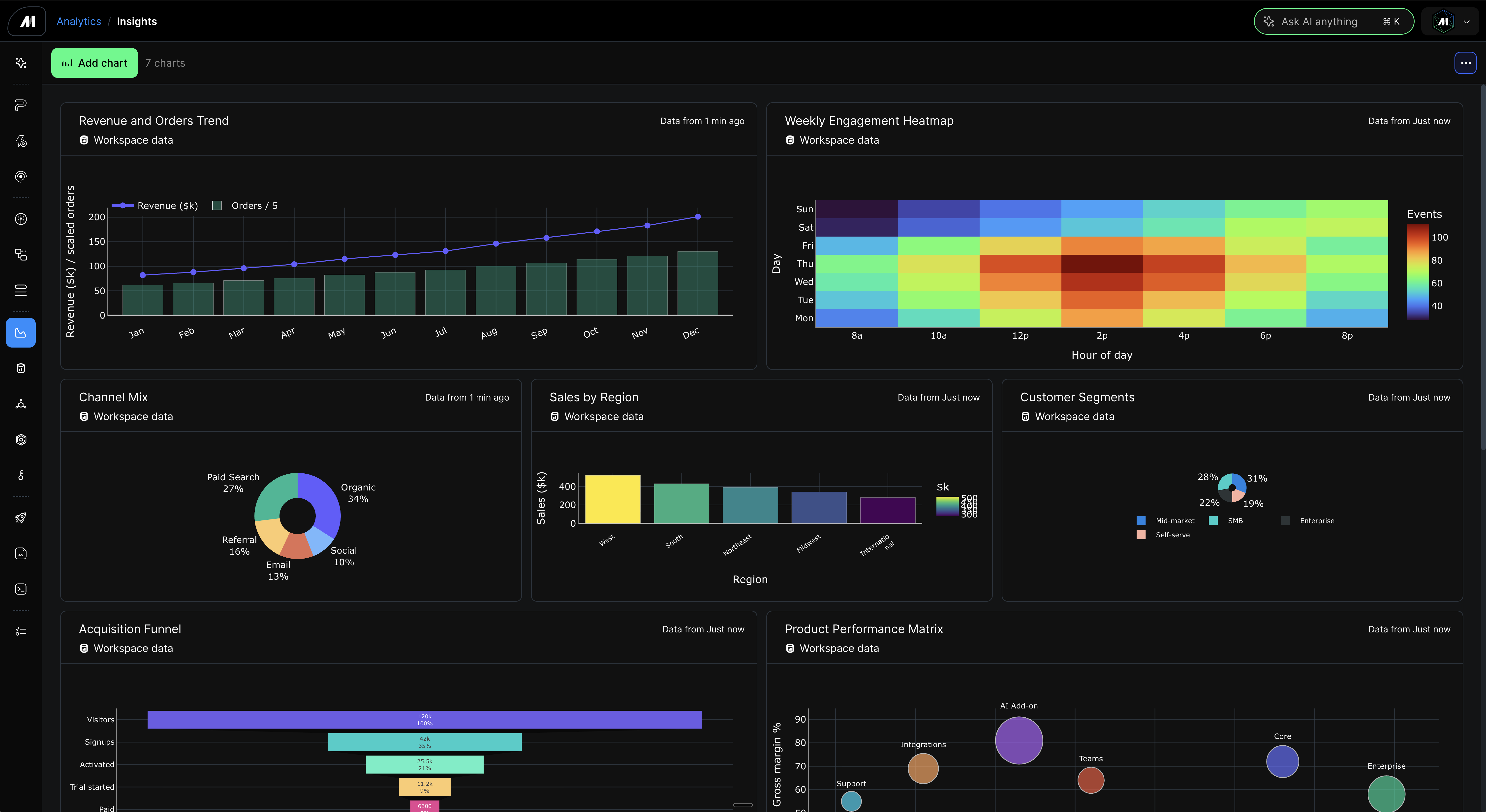 ## Access Analytics
Open Analytics from the Mage Pro app navigation, or go directly to:
```text theme={"system"}
/apps/analytics/dashboards
```
This is the Analytics workspace. From there, you can create dashboards, open existing dashboards,
add charts, edit charts with AI, refresh data, and arrange the dashboard layout.
## What Analytics helps you do
Analytics is built for fast, practical answers:
| Goal | Example |
| ----------------------------------------- | ------------------------------------------------------------------------------------ |
| Track business performance | Revenue, churn, expansion, renewals, account health, conversion, and retention. |
| Understand product usage | Weekly active users, feature adoption, activation, engagement, and funnel drop-off. |
| Operate data workflows | Failed records, validation errors, source freshness, SLA checks, and quality trends. |
| Review customer operations | Support volume, ticket aging, onboarding progress, and customer success risk. |
| Monitor models and experiments | Accuracy, drift, feature importance, confusion matrices, and experiment results. |
| Analyze warehouse or infrastructure spend | Cost by source, team, warehouse, workflow, or time period. |
Dashboards can include time series, comparisons, distributions, rankings, tables, heatmaps, funnels,
scorecards, and other visual summaries. Start with the business question you want answered, and
Mage helps turn the available data into a useful view.
## Create a dashboard
1. Open `/apps/analytics/dashboards`.
2. Click **New dashboard**.
3. Name the dashboard for the audience or decision it supports, such as `Executive revenue`,
`Customer health`, `Product adoption`, or `Data quality`.
4. Open the dashboard.
5. Click **Add chart** to create the first visualization.
Keep dashboards focused. A good dashboard usually answers one type of question for one audience:
executive reporting, growth analysis, customer operations, data quality, model review, or cost
tracking.
## Add charts with AI
Click **Add chart**, then describe the outcome you want. AI Sidekick uses the dashboard and the
data you are working with to create the chart and save it to the dashboard.
Useful prompts describe the metric, segment, time range, and decision:
```text theme={"system"}
Show monthly recurring revenue by plan type and highlight net revenue retention.
```
```text theme={"system"}
Compare weekly active users by customer tier for the last 12 weeks.
```
```text theme={"system"}
Show failed records by data source and list the most common validation errors.
```
```text theme={"system"}
Create a model quality dashboard with accuracy, recall, precision, and drift by week.
```
You can also create a chart while reviewing pipeline results. Click the chart action from a
supported result or preview, describe what you want to see, and Sidekick keeps the chart connected
to the right data.
For an existing chart, use **Edit with AI** to ask for changes:
1. Change the metric, grouping, or time period.
2. Add a comparison line or segment split.
3. Rename the chart or clarify labels.
4. Turn a trend into a ranking, scorecard, table, or heatmap.
5. Simplify a noisy chart for an executive audience.
## Choose the right data
Analytics can visualize the data your Mage project already works with:
| Data source | Customer outcome |
| --------------------------- | ------------------------------------------------------------------------------------------------------------------------------------------------------------ |
| IO data sources | Build dashboards from connected databases, warehouses, object storage, APIs, and other sources your project can already read from. |
| Pipeline block outputs | Turn the results produced by loaders, transformers, exporters, and custom blocks into dashboards without moving data into another BI tool first. |
| Pipeline runs | Chart run volume, success rate, duration, freshness, or business metrics captured each time a pipeline runs. |
| Block runs | Compare block-level outcomes, failures, processing time, row counts, validation results, or model metrics across runs. |
| Data previews | Explore a dataset, choose the columns and shape that answer the question, then save a chart from the preview lineage instead of only the visible row window. |
| Warehouse-backed data | Summarize large tables into focused metrics before they appear on the dashboard. |
| Transformed datasets | Apply business logic, cleanup, or grouping before the chart is shown. |
| Structured workflow outputs | Visualize tables, records, metrics, matrices, rankings, and other useful shapes produced by your workflows. |
That means Analytics can cover both business data and workflow activity. For example, one
dashboard can show revenue by customer segment, failed records by source, pipeline run duration,
block run failures, and model quality by training run.
When you build charts from pipeline or block outputs across multiple runs, Sidekick checks the
output grain before choosing the chart. Run-summary outputs are useful for operational trends such
as run volume, checked time, row counts, failures, and block duration. Business-date charts, such as
deals by close date or invoices by paid date, need rows that represent the business records and a
matching business date field. If the available output only contains run summaries or nested saved
state, Sidekick should state that coverage before saving the chart.
For large datasets, ask for the summary you need rather than every raw row. For example, ask for
"weekly active users by plan for the last 12 weeks" or "top 20 accounts by expansion revenue" so
the dashboard stays fast and readable. When a chart starts from a data preview, Analytics uses the
preview source and query plan to build a chart-owned dataset snapshot; it does not use only the
rows currently visible in the preview table.
Analytics stores a bounded chart-ready snapshot for each saved chart. If Sidekick warns that a
time-series or ordered chart may have reached its dataset preview limit, narrow the request, group
the data into coarser buckets, or ask Sidekick to state the covered date or category range before
using the chart for decisions.
## Organize dashboards for the team
Each chart appears as a card on the dashboard. You can:
1. Rename charts so viewers immediately understand the metric.
2. Edit charts with AI as the question changes.
3. Duplicate a chart to test another view without losing the original.
4. Drag charts into a new order to create a clear story from top to bottom.
5. Resize charts so the most important metrics get more space.
6. Group related charts together so trends, drivers, and details are easy to scan.
7. Remove charts that are no longer useful.
8. Refresh charts when the underlying data has changed.
Use the top of the dashboard for the metrics that matter most. Put detailed breakdowns, tables,
and diagnostics after the summary so viewers can move from signal to detail.
Dashboard layouts are flexible. Drag a chart to rearrange the page, make headline metrics larger,
give detailed tables more room, or place related charts side by side. This makes it easy to turn a
collection of charts into a polished dashboard for a meeting, executive review, customer health
check, or recurring operational workflow.
## Refresh data
Analytics dashboards are meant to stay useful after the first version. When the source data
changes, refresh the chart or dashboard so viewers see the latest available results.
Refresh is useful for recurring reporting:
1. Daily revenue and usage snapshots.
2. Weekly customer health reviews.
3. Data quality checks after each pipeline run.
4. Model evaluation after new training or scoring jobs.
5. Warehouse cost reviews at the end of a billing period.
If a refresh cannot complete, Mage keeps the previous dashboard view available so your team does
not lose the last known good result.
## Recommended dashboard patterns
### Executive dashboard
Use this for a high-level business review. Start with scorecards and simple trends, then add a few
breakdowns that explain why the numbers changed.
Example charts:
1. Monthly recurring revenue.
2. New, expansion, contraction, and churned revenue.
3. Net revenue retention by segment.
4. Top growing accounts.
5. Accounts at risk.
### Product dashboard
Use this for adoption, activation, and engagement analysis.
Example charts:
1. Weekly active users by plan.
2. Activation funnel by signup cohort.
3. Feature adoption by account tier.
4. Retention by cohort.
5. Most common user paths or events.
### Data quality dashboard
Use this for operational trust in your pipelines and datasets.
Example charts:
1. Failed records by source.
2. Validation errors by type.
3. Freshness by table or pipeline.
4. Duplicate records over time.
5. Missing values by field.
### Model quality dashboard
Use this for ML and AI workflows where stakeholders need to see model behavior over time.
Example charts:
1. Accuracy, recall, and precision by evaluation date.
2. Prediction volume by class.
3. Drift by feature.
4. Confusion matrix summary.
5. Experiment comparison by metric.
## Best practices
1. Start with the decision the dashboard should support.
2. Use plain-language chart titles, such as `Revenue by plan` or `Failed records by source`.
3. Group charts by story: summary, drivers, segments, and diagnostics.
4. Keep raw-detail tables secondary unless the dashboard is for debugging or operations.
5. Use AI edits to iterate quickly, then keep the clearest version.
6. Create separate dashboards for separate audiences.
7. Refresh dashboards before recurring business reviews.
## Troubleshooting
| Symptom | What to check |
| ------------------------------------------ | ---------------------------------------------------------------------------------------------------------------- |
| The dashboard is empty | Create a dashboard, then add at least one chart from data available in Mage. |
| Sidekick cannot create a chart | Run the relevant pipeline or block so there is data to inspect, then try **Add chart** again. |
| A chart shows no data | Check whether the selected data is empty, filtered too narrowly, or missing the metric you asked for. |
| Refresh fails | Confirm the source data is still available and retry. The previous dashboard view remains available. |
| The dashboard feels too busy | Split it into separate dashboards by audience or decision, then keep only the most important charts on each one. |
| The layout feels crowded on a small screen | Charts stack on compact screens. Use a desktop browser for precise dashboard layout work. |
## Access Analytics
Open Analytics from the Mage Pro app navigation, or go directly to:
```text theme={"system"}
/apps/analytics/dashboards
```
This is the Analytics workspace. From there, you can create dashboards, open existing dashboards,
add charts, edit charts with AI, refresh data, and arrange the dashboard layout.
## What Analytics helps you do
Analytics is built for fast, practical answers:
| Goal | Example |
| ----------------------------------------- | ------------------------------------------------------------------------------------ |
| Track business performance | Revenue, churn, expansion, renewals, account health, conversion, and retention. |
| Understand product usage | Weekly active users, feature adoption, activation, engagement, and funnel drop-off. |
| Operate data workflows | Failed records, validation errors, source freshness, SLA checks, and quality trends. |
| Review customer operations | Support volume, ticket aging, onboarding progress, and customer success risk. |
| Monitor models and experiments | Accuracy, drift, feature importance, confusion matrices, and experiment results. |
| Analyze warehouse or infrastructure spend | Cost by source, team, warehouse, workflow, or time period. |
Dashboards can include time series, comparisons, distributions, rankings, tables, heatmaps, funnels,
scorecards, and other visual summaries. Start with the business question you want answered, and
Mage helps turn the available data into a useful view.
## Create a dashboard
1. Open `/apps/analytics/dashboards`.
2. Click **New dashboard**.
3. Name the dashboard for the audience or decision it supports, such as `Executive revenue`,
`Customer health`, `Product adoption`, or `Data quality`.
4. Open the dashboard.
5. Click **Add chart** to create the first visualization.
Keep dashboards focused. A good dashboard usually answers one type of question for one audience:
executive reporting, growth analysis, customer operations, data quality, model review, or cost
tracking.
## Add charts with AI
Click **Add chart**, then describe the outcome you want. AI Sidekick uses the dashboard and the
data you are working with to create the chart and save it to the dashboard.
Useful prompts describe the metric, segment, time range, and decision:
```text theme={"system"}
Show monthly recurring revenue by plan type and highlight net revenue retention.
```
```text theme={"system"}
Compare weekly active users by customer tier for the last 12 weeks.
```
```text theme={"system"}
Show failed records by data source and list the most common validation errors.
```
```text theme={"system"}
Create a model quality dashboard with accuracy, recall, precision, and drift by week.
```
You can also create a chart while reviewing pipeline results. Click the chart action from a
supported result or preview, describe what you want to see, and Sidekick keeps the chart connected
to the right data.
For an existing chart, use **Edit with AI** to ask for changes:
1. Change the metric, grouping, or time period.
2. Add a comparison line or segment split.
3. Rename the chart or clarify labels.
4. Turn a trend into a ranking, scorecard, table, or heatmap.
5. Simplify a noisy chart for an executive audience.
## Choose the right data
Analytics can visualize the data your Mage project already works with:
| Data source | Customer outcome |
| --------------------------- | ------------------------------------------------------------------------------------------------------------------------------------------------------------ |
| IO data sources | Build dashboards from connected databases, warehouses, object storage, APIs, and other sources your project can already read from. |
| Pipeline block outputs | Turn the results produced by loaders, transformers, exporters, and custom blocks into dashboards without moving data into another BI tool first. |
| Pipeline runs | Chart run volume, success rate, duration, freshness, or business metrics captured each time a pipeline runs. |
| Block runs | Compare block-level outcomes, failures, processing time, row counts, validation results, or model metrics across runs. |
| Data previews | Explore a dataset, choose the columns and shape that answer the question, then save a chart from the preview lineage instead of only the visible row window. |
| Warehouse-backed data | Summarize large tables into focused metrics before they appear on the dashboard. |
| Transformed datasets | Apply business logic, cleanup, or grouping before the chart is shown. |
| Structured workflow outputs | Visualize tables, records, metrics, matrices, rankings, and other useful shapes produced by your workflows. |
That means Analytics can cover both business data and workflow activity. For example, one
dashboard can show revenue by customer segment, failed records by source, pipeline run duration,
block run failures, and model quality by training run.
When you build charts from pipeline or block outputs across multiple runs, Sidekick checks the
output grain before choosing the chart. Run-summary outputs are useful for operational trends such
as run volume, checked time, row counts, failures, and block duration. Business-date charts, such as
deals by close date or invoices by paid date, need rows that represent the business records and a
matching business date field. If the available output only contains run summaries or nested saved
state, Sidekick should state that coverage before saving the chart.
For large datasets, ask for the summary you need rather than every raw row. For example, ask for
"weekly active users by plan for the last 12 weeks" or "top 20 accounts by expansion revenue" so
the dashboard stays fast and readable. When a chart starts from a data preview, Analytics uses the
preview source and query plan to build a chart-owned dataset snapshot; it does not use only the
rows currently visible in the preview table.
Analytics stores a bounded chart-ready snapshot for each saved chart. If Sidekick warns that a
time-series or ordered chart may have reached its dataset preview limit, narrow the request, group
the data into coarser buckets, or ask Sidekick to state the covered date or category range before
using the chart for decisions.
## Organize dashboards for the team
Each chart appears as a card on the dashboard. You can:
1. Rename charts so viewers immediately understand the metric.
2. Edit charts with AI as the question changes.
3. Duplicate a chart to test another view without losing the original.
4. Drag charts into a new order to create a clear story from top to bottom.
5. Resize charts so the most important metrics get more space.
6. Group related charts together so trends, drivers, and details are easy to scan.
7. Remove charts that are no longer useful.
8. Refresh charts when the underlying data has changed.
Use the top of the dashboard for the metrics that matter most. Put detailed breakdowns, tables,
and diagnostics after the summary so viewers can move from signal to detail.
Dashboard layouts are flexible. Drag a chart to rearrange the page, make headline metrics larger,
give detailed tables more room, or place related charts side by side. This makes it easy to turn a
collection of charts into a polished dashboard for a meeting, executive review, customer health
check, or recurring operational workflow.
## Refresh data
Analytics dashboards are meant to stay useful after the first version. When the source data
changes, refresh the chart or dashboard so viewers see the latest available results.
Refresh is useful for recurring reporting:
1. Daily revenue and usage snapshots.
2. Weekly customer health reviews.
3. Data quality checks after each pipeline run.
4. Model evaluation after new training or scoring jobs.
5. Warehouse cost reviews at the end of a billing period.
If a refresh cannot complete, Mage keeps the previous dashboard view available so your team does
not lose the last known good result.
## Recommended dashboard patterns
### Executive dashboard
Use this for a high-level business review. Start with scorecards and simple trends, then add a few
breakdowns that explain why the numbers changed.
Example charts:
1. Monthly recurring revenue.
2. New, expansion, contraction, and churned revenue.
3. Net revenue retention by segment.
4. Top growing accounts.
5. Accounts at risk.
### Product dashboard
Use this for adoption, activation, and engagement analysis.
Example charts:
1. Weekly active users by plan.
2. Activation funnel by signup cohort.
3. Feature adoption by account tier.
4. Retention by cohort.
5. Most common user paths or events.
### Data quality dashboard
Use this for operational trust in your pipelines and datasets.
Example charts:
1. Failed records by source.
2. Validation errors by type.
3. Freshness by table or pipeline.
4. Duplicate records over time.
5. Missing values by field.
### Model quality dashboard
Use this for ML and AI workflows where stakeholders need to see model behavior over time.
Example charts:
1. Accuracy, recall, and precision by evaluation date.
2. Prediction volume by class.
3. Drift by feature.
4. Confusion matrix summary.
5. Experiment comparison by metric.
## Best practices
1. Start with the decision the dashboard should support.
2. Use plain-language chart titles, such as `Revenue by plan` or `Failed records by source`.
3. Group charts by story: summary, drivers, segments, and diagnostics.
4. Keep raw-detail tables secondary unless the dashboard is for debugging or operations.
5. Use AI edits to iterate quickly, then keep the clearest version.
6. Create separate dashboards for separate audiences.
7. Refresh dashboards before recurring business reviews.
## Troubleshooting
| Symptom | What to check |
| ------------------------------------------ | ---------------------------------------------------------------------------------------------------------------- |
| The dashboard is empty | Create a dashboard, then add at least one chart from data available in Mage. |
| Sidekick cannot create a chart | Run the relevant pipeline or block so there is data to inspect, then try **Add chart** again. |
| A chart shows no data | Check whether the selected data is empty, filtered too narrowly, or missing the metric you asked for. |
| Refresh fails | Confirm the source data is still available and retry. The previous dashboard view remains available. |
| The dashboard feels too busy | Split it into separate dashboards by audience or decision, then keep only the most important charts on each one. |
| The layout feels crowded on a small screen | Charts stack on compact screens. Use a desktop browser for precise dashboard layout work. |