> ## Documentation Index
> Fetch the complete documentation index at: https://docs.mage.ai/llms.txt
> Use this file to discover all available pages before exploring further.
# Personalize your workspace
> Customize workspace themes, personalize accounts, and re-configure UI component layouts.
export const ProOnly = ({button = 'Get started for free', description = 'Try our fully managed solution to access this advanced feature.', source = 'documentation', title = 'Only in Mage Pro.'}) =>
;
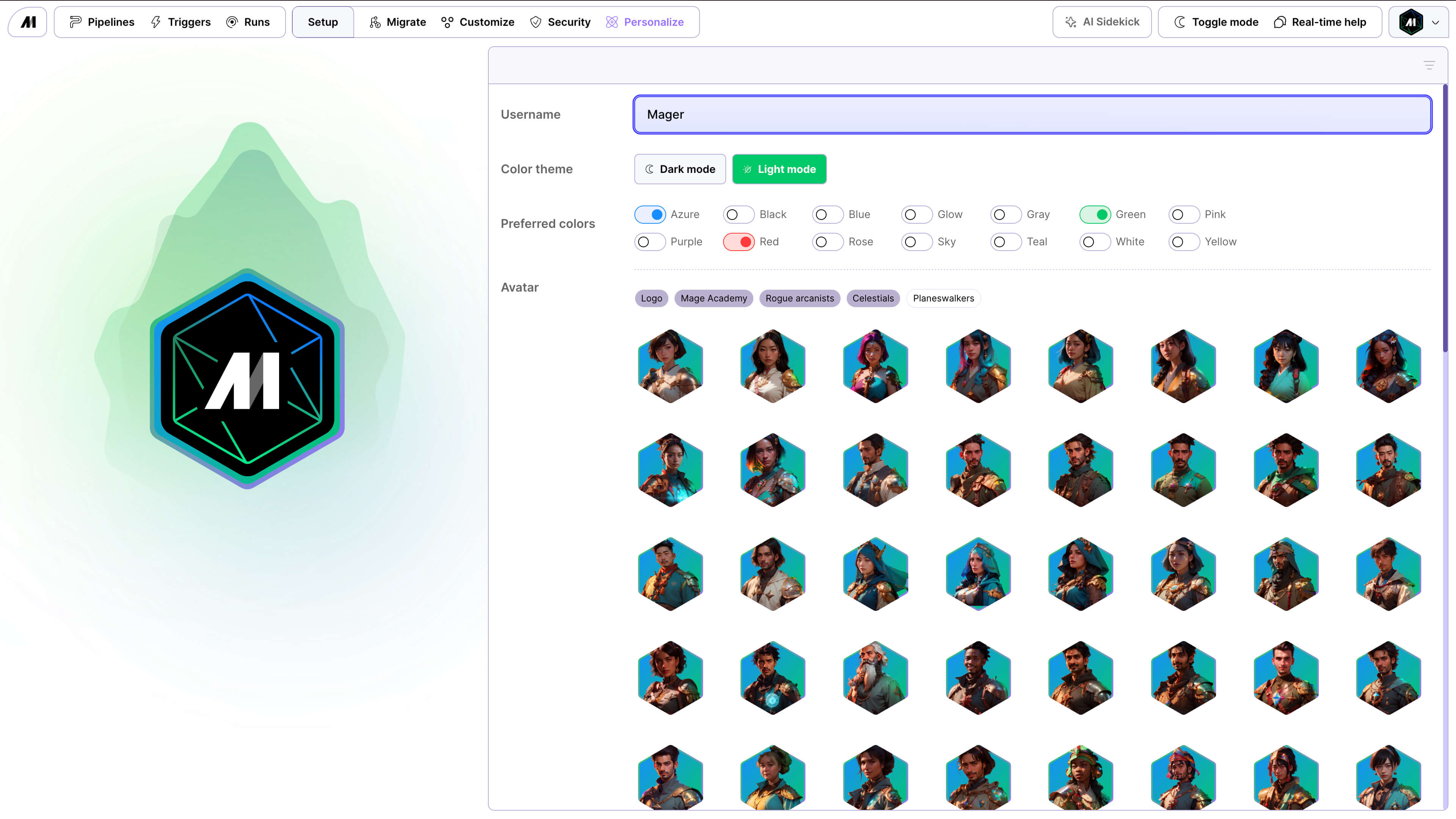
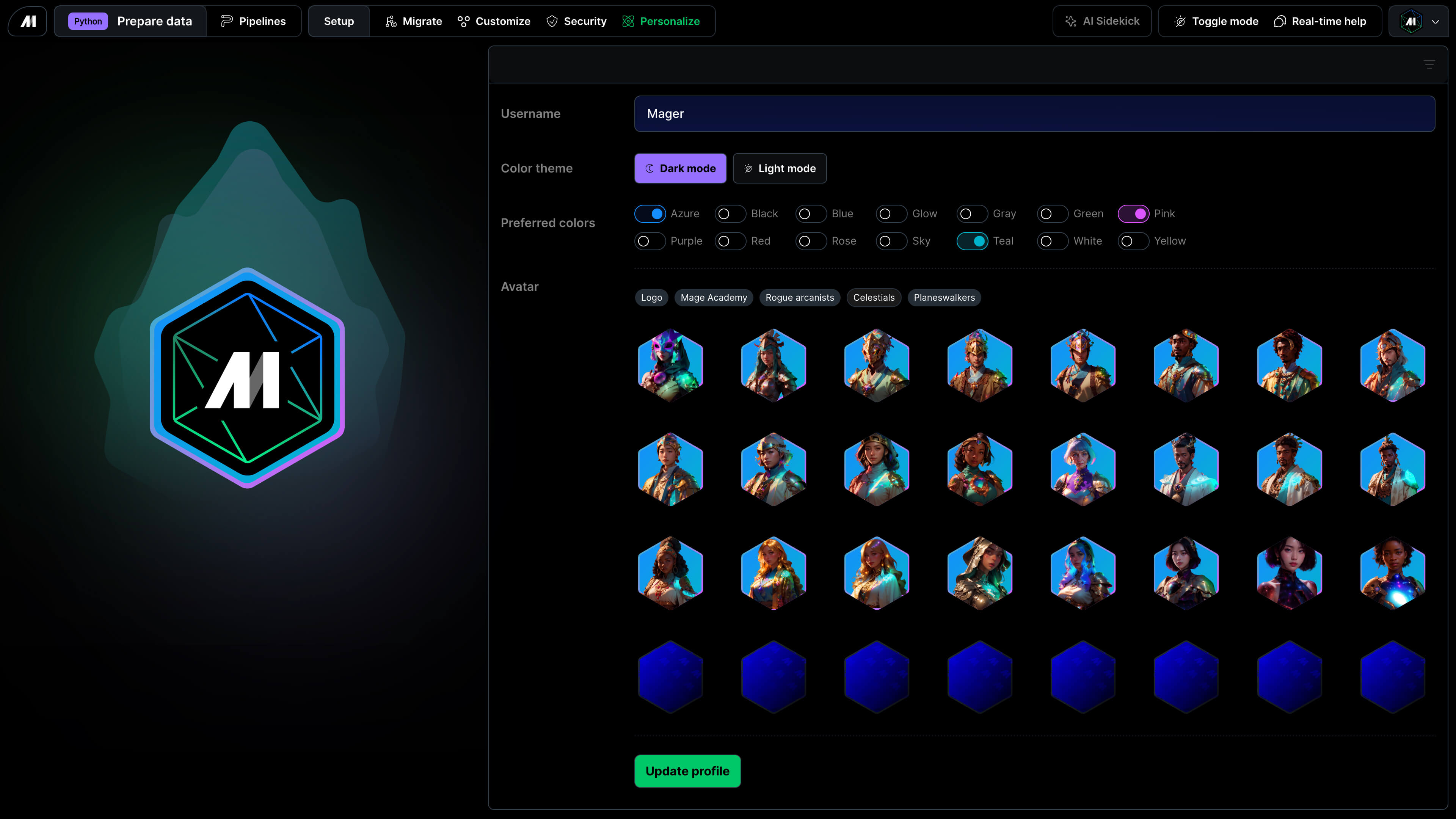
## Themes
***
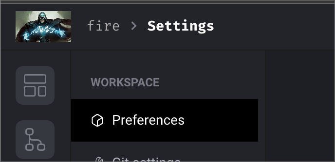
## Logo
Change the logo that appears in the top left corner.
***
## Layout
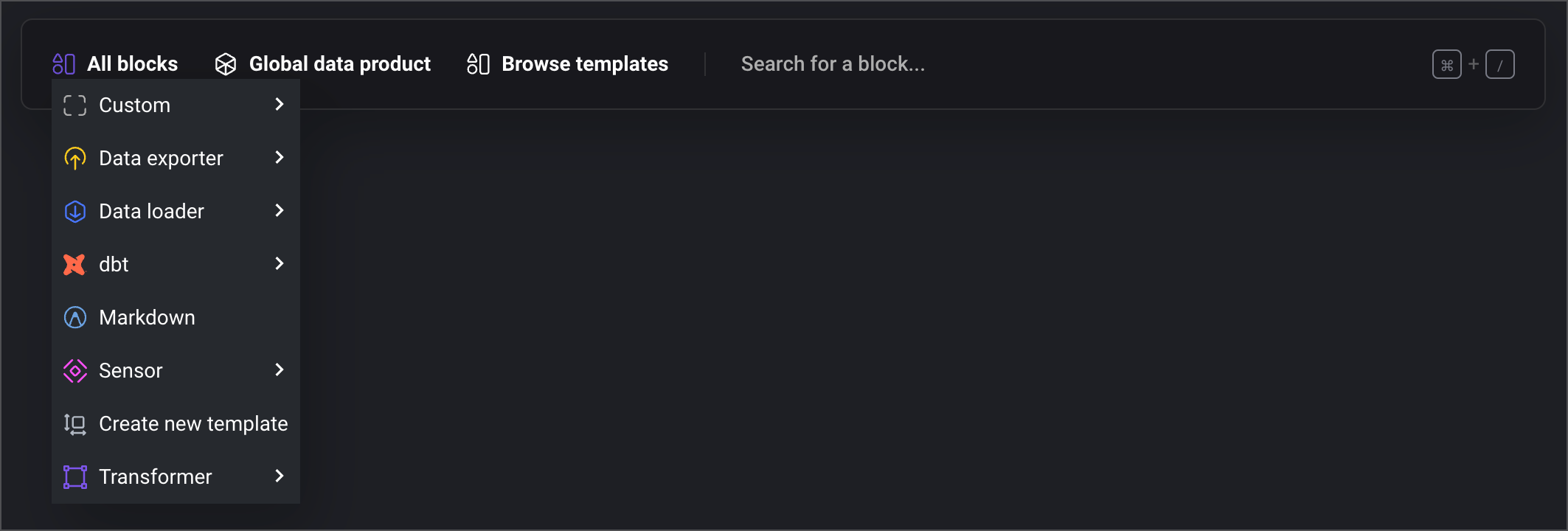
### Add block buttons
Customize the buttons that show up by default on the Add new block bar on the notebook page
while building a pipeline.
You can change the order of what appears first as well as which buttons are visible by default
and which are displayed when the dropdown menu is shown after clicking the button All blocks.
 ***
## Logo
Change the logo that appears in the top left corner.
***
## Logo
Change the logo that appears in the top left corner.